Agata Dudek, czyli

Agata Dudek, that is…

We’ve been waiting for a really long time, but it was worth it. We’ve received a kind of full option offer. Starting with that we’ve got not only the poster itself but also a thought which develops in three directions. How not surprising – Agata Dudek is well known for working in that way, which she confirms herself in lots of interviews. But a single glimpse at her works is just enough though. And what is more, each element of series is so up-to-point that it is practically unchangeable.

Agata Dudek, czyli (2)
Agata Dudek, Satyrykon 2016, Poster

The slogan itself has become epic indeed. Written with with the Dudek’s “Disobedient Typography” font – what lots of memories it brings – it summarises the whole socio-artistic history of Satyrykon. It reflects all those wonderings and hangings, shining, ups and downs… And wittily added PLUS twists out of all those long lasting habits. It poses a question about the relation between the presumable worldliness and that “local colour” gained through the years as if it was the weight people so naturally put on with their age. It might be just a caption, would anyone who hasn’t been coming to Legnica for a long time been able to create it though?

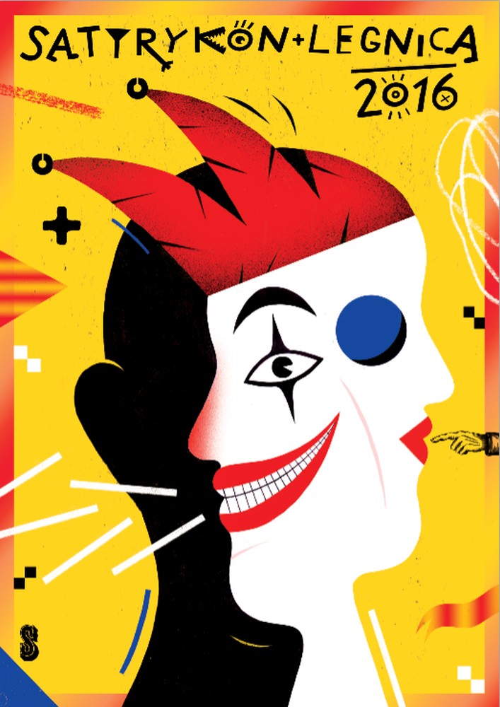
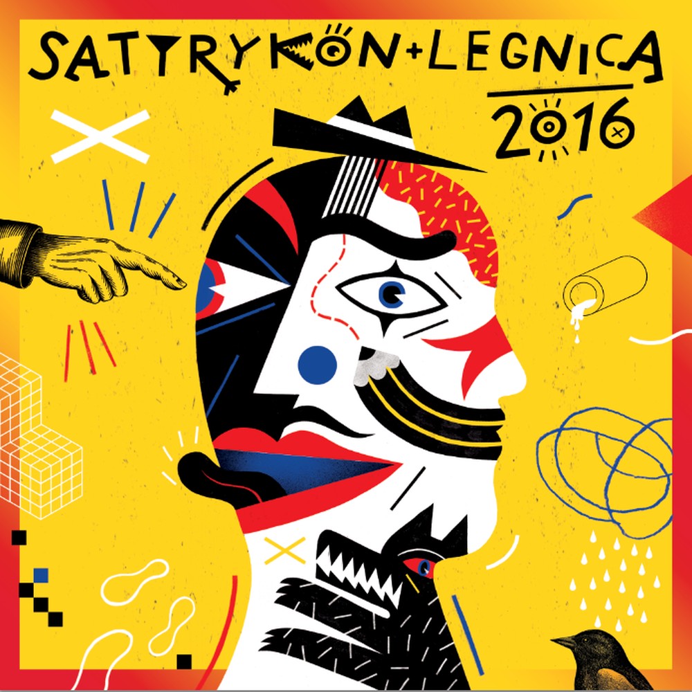
The minimalist might have stopped here on the typographic poster, but Agata Dudek is just about to start at that point. Let’s get to the leitmotif and drop the line to the potential “dudkologists” that it links somehow to Prima Aprilis although it’s not the most important here. What counts is rather how the meaningful Satyrykon’s face changes depending on the situation…

And most obvious, full of smiles and kisses – Invitation. It promises a lot… Elegant clothes suggested, but you’ll have time of your life anyway. And those bifurcated, oh pardon, the let lose tongues? Hmm, let’s presume they implicate some international quality.

Agata Dudek, czyli (3)
Agata Dudek, Satyrykon 2016, Invitation

Satyrykon has also got its other side although it doesn’t necessarily mean the tendency to black-and-white simplifications. There’s as much cry as whisper in it, as much ego as id, a bit more of pierrot than the jester… Such a portrait is already a pop-culture. Everyone will remember that simple message which goes along with joyful and attractive energy of pure colours. Easily caught even from the car seat, not to mention the ones on their bikes. The passer-by will stop as apart from the first impression, which won’t be beaten by McDonald’s, they’ll notice quite a lot of details. And honestly speaking, hell only knows if these are symbols or rather friendly indications for the printer. The stripes of colour with… bird’s face. Has only S been left of all the junk? That would be nice. And all that taken together is just intriguing enough to make you come and even reach for catalogue.

Agata Dudek, czyli
Agata Dudek, Satyrykon 2016, Paper-back

However, one thing is sure: Agata Dudek and her joyful malice, provoking wealth of ideas (well thought over though) in areas where due to different reasons others used to hold themselves up a bit, brings new aesthetics to Satyrykon. Quite sincerely, one could wish it wouldn’t happen in poster only…

www.agatadudek.pl/

www.facebook.com/DUDU

Skip to content