2011 – Studio of Illustration, Academy of Fine Arts in Warsaw
2012 – Illustration Studio at Academy of Fine Arts in Gdańsk
2013 – Graphic Design Department of the Faculty of Graphic Arts and Media Arts, Academy of Art and Design in Wrocław
2014 – ?

The Studio of Book Graphics was launched in 2009, when the accelerating technological evolution of digital carriers and channels of distribution gave rise to many discussions on the future of the book. The more radical participants of the debate envisaged the impending decline of the archaic code, and so postulated putting a definitive end to book design education whatsoever.
The students of workshop graphics at the Academy of Fine Arts in Katowice themselves had proven these opinions invalid. Faced with technological change, they suddenly exhibited an odd, unprecedented in years, interest in book realizations. This had become a direct push for the studio to be formed.
The unexpected liking on the students’ side fit in with the general tendencies for exploring creative opportunities that could accompany a change in status of the book. A traditional volume, now playing a lesser role as a carrier of information, gains in importance as an editorial object, and an autonomous means of expression. This situation is favoured by the wide accessibility of digital printing technologies. Using these, author’s creation takes various forms – from unique self-publishing, even to books treated as a sculpture matter, and laser cut.
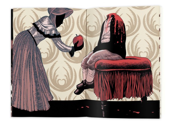
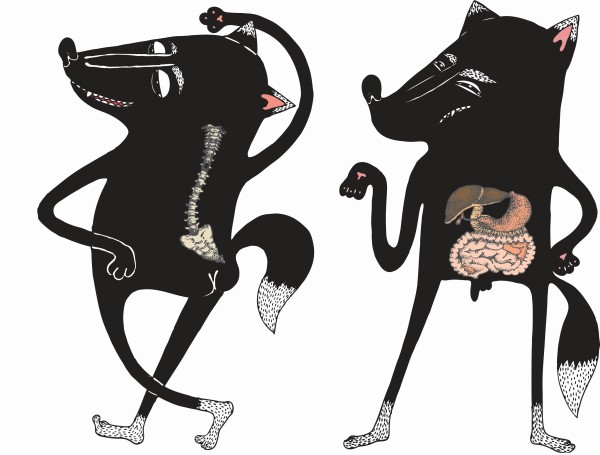
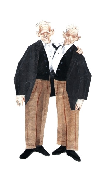
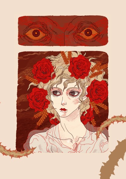
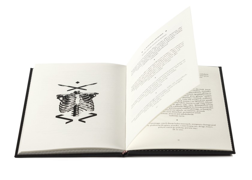
Books made in the Katowice studio are also free displays of author’s expression. We need to stress, though, that in this case content is integral with form, and thus our students’ works refer to the tradition of author’s book and liberature as well.
The studio is situated within the Chair of Workshop Graphics, which largely determines the character of designs made here. Students, working in the mode of individual search, often closer to artistic activities than to functional design, are after a form possibly most relevant to the given theme. Not each and every realized work takes a form of a traditional book, but the technological aspect – bookbinding and current exploration of local printing shops – is a major element of students’ education.
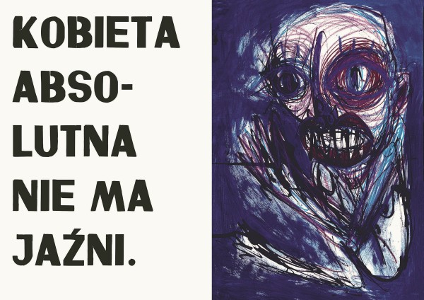
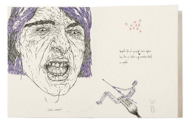
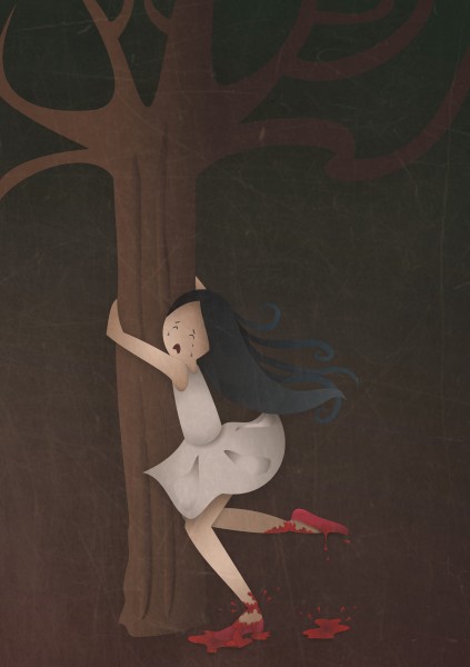
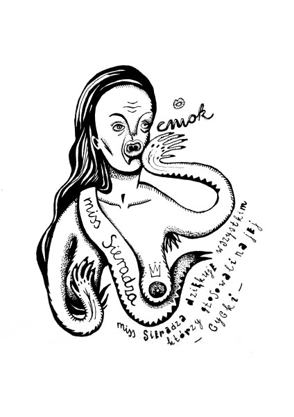
The title proneness to sharpness naturally characterizes most of the books made in the studio, proves the sense of humour and unrestrained imagination of their designers, and brings incessant joy to all involved in the projects.
Running the studio, we always try and foster our students’ dark visions, and even stimulate their sensitive insides by suggesting topics of semestral works. To be completely honest, however, we need to say that our suggestions sometimes make students flee. Undeterred, we still invite you to our studio and would like to thank all the students involved in the exhibition.
Bogna Otto-Węgrzyn
Roman Kaczmarczyk
Katarzyna Wolny
Revolution!/Revelation!
In 1899, Charles H. Duell, commissioner of the U.S. patent office, purportedly claimed that everything that can be invented has been invented. This thought, when taken literally, seems absurd at first, however, it may serve as a telling metaphor. As Marshall McLuhan said, the new media continue and develop the elements of their predecessors rather than fully replace them. Lev Manovich agrees with him, as he talks about strategies [which] are now free floating in our culture, available for use in new contexts. This observation seems valid, as along with technological progress, the use of modern devices more and more frequently resembles using basic tools humanity has known for ages. Even the scientists submerged in the element of cyberspace, like Jay David Bolter, perceive the computer hypertext as a continuation of the way literature was presented in the Homer times. The sequential and discursive Homer style, contrasting with a word fixed on the printed page, tends to be surprisingly similar to the “liquid” text of post-Gutenberg era. For a good reason we talk about the first and second orality epochs, divided with a period of print expansion. It is worth a mention, though, that the virtual hypertext is in fact a hybrid of dynamic speech and permanent record.
We may ask what place, in the virtual era, the products of traditional culture of print take. Based on the technology previously associated with “acceleration” of communication, today they are very often perceived as a relict, artistically explored by all kinds of “slow” movements.
Analysis of print as invention usually highlights its influence upon acceleration of modern changes, primarily connected with Reformation and further stream of subsequent revolutions. For ideologists, this newly invented technique turned out to be an extremely effective propaganda instrument. The vector for this revolutionary process is the ambiguous gspeed,h perceived by the contemporary philosopher Paul Virilio as a basic agent shaping our civilization, and being the motor of its destruction at the same time.
Along with development of printing techniques and processes of “mechanical reproduction” (after Walter Benjamin), speed translates into quantity, making the mass-production one of the attributes of modernity. What used to be a unit, had become a part of a rapidly growing and accelerating circulation – a loose conglomerate of private initiatives at first, getting organized into a network concentrated around the publishing giants. As the culture of print solidified, mechanisms of mass-sale contributed to forcing any unconventional enterprises out into the area of a remote, but very creative margin accumulating the most revolutionary potential. It was not uncommon for the non-commercial author’s publishing projects to result in a considerable success radiating also onto the market “core” of the main stream – so did the literary works by Marcel Proust, artistic books by William Blake or the avant-garde liberary bestseller The Life and Opinions of Tristram Shandy, Gentleman by the 18th-century gpostmodernisth Laurence Sterne, to name a few. Thus the power of self-publishing phenomenon did not rely upon gspeedh nor gmass-production,h but primarily on the full independence of an author.
Going back to the source, we may assume that Martin Luther – the father of religious revolution – is in a sense the father of self-publishing as well.
The famous theses he published at his own cost, thanks to developing craft of print became known all over Germany in just two weeks, and circulated in Europe in a month, with no effort on the author’s side. The success of 1517 pamphlets brings to mind the scope of influence by some underground magazines (zines), used to present the society with most radical ideas.
Shaped in the zeal of ideological struggles, the independent circulation of flyers had stimulated artistic innovation: primarily made for decoration and entertainment only, grotesques, Vexierbild [hidden faces] and Medley prints became successfully annexed by the “involved” religious and political caricature. Independent publications of the kind had still more in common with editions of graphics (such as interventionist cycles by Hogarth or Goya), than with traditional books, based on the much less compacted message. It’s worth a notice that it was graphics that frequently anticipated the ideas which later were taken over by painting. As it was widespread and largely independent from the official patrons of the arts, graphics was free of the limitations characteristic of painting, and became a field for experiments and an intersection of the high and low culture influences.
“Egalitarian” graphics, strongest of all the media connected to the current political events, fashion, and customs, is an artistic technique closely related – according to Mieczysław Porębski – to the “ regional,” carnival – ludic element. This very movement gave rise to the unorthodox and anarchic fumiste [jokers], who published in the press first, and then assembled, as Arts Incoherents, their own independent artistic anti-salon, along with the whole line of “anti-catalogues.” These still remain the main source of knowledge on their proto-conceptual strategies, later drawn upon by futurists, dadaists and surrealists alike. Independent publishing circulation was one of the drives for the manifestos of the first and second avant-garde as well, with the full spectrum of their counter-cultural effluence.
As digital media developed, and thus the Internet has become the space offering the most effective communication tools, the idea of self-publishing within the traditional culture of print has been remodeled. A contemporary artbook – a customized product – functions like an inexpensive, gserial unith piece of art. The collector’s and tactile (tangible) values of bibliophilic publications have gained importance, as they correspond well with the haptic aesthetics of the iPad era. With the garchaich printing techniques easily available, the exclusive objects-books more frequently paid homage to liberary tradition, promoting total literature, inextricably tied with its physical carrier. Effective grevolutionsh (developing dynamically in the tangle of virtual space) yielded primacy to more private grevelationsh (thus – by etymology – unveiling / discovery), presented on the pages of artbooks and artzines by their emancipated authors. This declaration of independence went hand in hand with the passion for rareness, typical of oddities collectors on the threshold of early modern period. For many ages, private cabinets of curiosities functioned as autonomic artistic creations, formed through compilation of objects of various origin and treated as metaphorical descriptions of gthe world in miniature.h Collections would sometimes undergo gvirtualization,h with original objects being replaced with their graphic representations, and as such accumulated in hefty catalogues – this could have been a prelude to the 19th-century initiative of Mundaneum, the library its creators (Paul Otlet and Henri La Fontaine) assumed should gather together all the world’s knowledge.
Contemporary artbooks – as gexhibition-booksh – more often than not resemble private collections of peculiar findings, enclosed between the front and back cover. These Duchamp’s gready-madesh themselves become exhibits in collections, where names of newly discovered worlds run along spines of books crammed on bibliophile-collector’s shelf.
Jakub Woynarowski

SHARP-EYE SKILLS
Katowice Fine Arts Academy students’ exhibition
Modrzejewska Theatre, Legnica
(4 June – 30 August 2014)