Interview with Anna Pałosz
Satyrykon: Have you chosen Katowice academy due to its poster design traditions, or has it been at the academy that you have taken an interest in poster?
Anna Pałosz: Poster has always been close to me, the means it uses (mental shortcut, synthesis) to be exact. The Poster Design Workshop seemed to be a natural choice for me. I got to know The Academy of Fine Arts in Katowice a little bit closer thanks to dr Ewa Stopa-Pielesz. She ran the classes of visual identification at Licemu Plastyczne in Bielsko-Biała (secondary art school) which I was a student of. I took fancy in designing graphical signs so much that I even decided to become a professional designer. However, as the time passed by, I noticed I’ve got too weak mind to process data, research and analyse design problems at a very high standard. I also missed some sort of freedom. Poster gives me the possibility of joining also my own ideas with the synthetic sign, which is an ideal matching for me. I think I can’t express my thoughts precisely either – my voice doesn’t have enough clout, so I feel much better when a poster speaks for me.
Is this the means of expression you’d like to bind your future with?
I’ll do my best to make this happen. But of course, it’s not only poster that matters in man’s life. Fortunately, there are a lot of other possibilities to use this poster-related thinking. A simple sign which I use in my posters is a universal, you can use it in many spheres of design.
For example, it helps to get awards in satirical competitions… But, coming back to the matter, a number of people in Katowice declares they love poster and believe that thanks to them the poster will survive (against the ones who announce its soon end). Where do you see the space for your works, e.g. in the galleries, at biennale or in the Internet?
Even Nostradamus’s prophecy – apart from temporary fear of midnight hour in 1999 – hasn’t brought any bigger changes. I think poster lives and is fine. Not only international competitions, but also numerous events related to poster and ones initialised by this medium lovers bear witness to that. It goes without saying that a poster functions in gallery space to much extent. However, the interest in biennale and competitions proves the need for graphically and contently sophisticated poster in our life. An outstanding sheet sometimes catches my eyes attention when I walk along the streets. It’s so appealing that makes me change my route in order to approach it and check what it’s about. I notice it in littered urban space in spite of the mass of leaflets, banners, LOW PRICEs and PROMOTIONs. For me, it shows the proof of how successful this means of communication is. Unfortunately, those who place orders aren’t so convinced and in result our streets are visual mess. Of course, you can’t get rid of it completely, but I’d like to change my route more often to make my eye meet some pleasant things for it.
How do you make your posters? Do you feel to be “analogue” work supporter: a sketch, painting, screen printing? Or rather a computer assisted work? Advocates of the first method claim that although graphic programmes offer enormous possibilities, the final result is never as good as in the case of hand work. (They find the reason for it in e.g. unpredictability or the pleasure of the contact with the matter…)
Everything starts from a page and a pencil, then the topic suggests the execution style. I admit I tend to use techniques which are applicable in the quiet atmosphere of my room. I use computer programmes only to polish some unwanted dirts. Although you might not see it in the final effect, most of my designs are carefully drafted on the sheet of paper. The draft reveals the nets drawn according to my secret rule.
A cycle devoted to Islandic cinema attracts special attention. Is it your bachelor’s degree? Where has the idea for it come from? Or maybe you just like Islandic cinema? Or – a thought stroke my mind – is it a laboratory construction of the situation which most of Polish poster designers faced in the past – creating posters which were their personality manifesto and author message for which the films (of no value and quite forgotten today, though posters stick to our memory) were just a suitable pretext?
Yes, it is a degree exam series. When I was creating it my fascination of Island was at its peak, and poster seemed to be the most suitable way of expressing my feelings. I always place the message first. I try to use symbols in my work, the signs which are clear for everyone. The technique I applied was just to show the climate of the island.
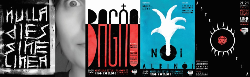
Not a day without a line – what does it mean? Is it a forced use of all available techniques although you don’t have any special sentiment for them?
Many ideas come to me quite suddenly and such was the case of “Nulla dies sine linea”. I don’t feel confident in photography art (which you could probably sense when looking at the poster). However, I thought this technique would fit best. I often try various methods but usually stay with my proven ones in which I feel unbounded – it’s important, as you don’ t percept any tiredness in the final result.
It’s a very consistent exhibition. (It has even arrived to us in a beautiful, specially made and consistent envelope which all suggests perfectionism). Is what we can see in it – limited number of colours, simple, a bit naïve or almost “primitive” means of expression a question of choice for the consistence of the exhibition, or is it expression of a deeper liking for these means?
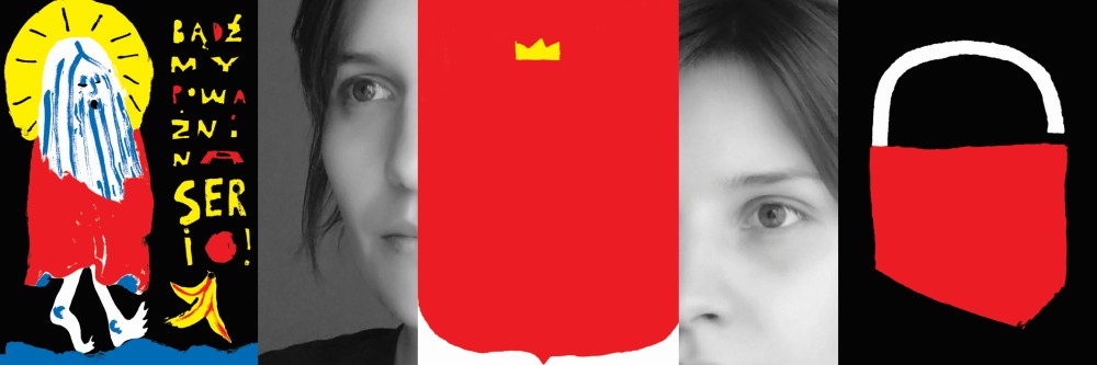
Consistency is very important to me. When I create series of illustrations/posters/gifts for my friends, everything needs to agree in the smallest detail. I guess you might call it my mania. Sometimes it grows too much, the problem in my head crushes against unnoticeable details. I have a problem in keeping focused and restricting the colours number helps to control the composition. The liking for limited colour palette and simplicity may directly originate from the rules of graphic design, or I may take it after my father, a constructor of different machines which he always paints in the same colours. Maybe it is an expression of missing for childhood, kindergarten and a colourful fence? I’m not sure – it’s just such a quick self-psychoanalyse.
Do you presume anybody in particular, out of all the well-known artists working at Katowice Academy (or any other from the past), to be your master?
It’s really hard for me to make my mouth (and fingers) deal with expression ‘master’. I bear particular feelings for the poster workshop run by professor Roman Kalarus, dr Monika Starowicz and Filip Ciślak. This absolutely wonderful trio form warm and liberal atmosphere which is so important to me. Any visitor to the workshop is warmly welcomed with a cup of coffee and a cake. Apart from talking of a poster itself, I can always confess my worries and count on understanding.I mainly mention the attitude to students. I appreciate my favourite artists as much for their style as for their personality and approach to life and people. I’d also like to mention professor Tomasz Jura for his much appreciated wit and work form
A number of poster designers admit they just “love a letter”. Do you create your own fonts or do you collect them from the Internet?
For me the letter and its character is significant. When I design e.g. a poster, typography must match the sign. I strongly avoid searching out the fonts in the Internet. I find a lot of pleasure in designing graphic signs but when it comes to typography – I’m terrified (a shame to admit once I’m a graphic design student). I feel much more comfortable in designing my own letters. Of course, in text I try to keep the form consistence, relations among signs.
Can a poster exist without a bit of humour?
Of course it can, but I try to avoid such works. I don’t like pathos, I don’t feel serious talking of serious issues, I try to take it with a pinch of salt.
And do you feel yourself a patriot?
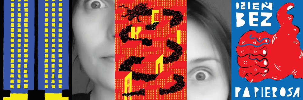
I certainly am a local patriot. I still agonise myself over a purchase of a close-by manor house by an entrepreneur although it was almost 20 years ago. The house was situated in the middle of a park which used to be my playground in the childhood. There are different forms of showing that you care of your country, your community. Satirical approach proves they aren’t indifferent to us, that we research the issue and we refer to it.
And a padlock just came to your mind or is it a quotation?
I get the impression that good ideas come from nowhere really. A padlock was such a case. It was a freezing cold evening and I was waiting for the bus… In order to warm up a bit I started sculpting a map of Poland in the snow. That was a creation moment. The association with the padlock came, I took a photo of it and after coming back home I transferred it on paper.
ANNA PAŁOSZ & REINALDO PAGÁN AVILA
Best debuts of Satyrykon 2017
Satyrykon Gallery, Rynek 36
13.06-29.07.2017
exhibition opening 4.00 p.m.